Inktober: The Headless Horseman

This year for #Inktober I decided to try and tell a story over the course the month, one day at a time. This is the Real story behind the Headless Horseman. Follow along on SketchbookJack’s Instagram.

Good evening, dear readers, I am your storyteller. Follow along this #inktober for the revealing of the real story of the headless horseman. Each day one panel of the story will be revealed.

Doodlers Anonymous Coloring Book

After whittling down from more than 600 entries, I have been featured in the Doodlers Anonymous Vol 3 coloring book. They are taking pre-orders at a reduced rate if you are interested in having great, pen and ink, hand drawn, one of a kind, drawings by an eclectic collection of great artists.

doodlers annonymous coloring book vol 3 page illustration preview

Captain and Crow’s ABCs

Here is a sneak peak of my latest book project. I am working on finding an agent and pitching around “The Island and the Plough” but I am continuing to build up other projects, because there are plenty more to come.

Here we have “Captain and Crow’s ABCs”.  The Captain finds a smart Crow who challenges him to to a test.  First he is asked if he knows his ABCs, to which the Captain replies “ARR!” only to be followed by asking what his favorite letter is.  Of course, it is R.  The crow challenges him to name a word for every letter in the alphabet that has an R sound in it.  Here, the Captain is almost stumped by the letter I, and  much confusion arises between I, eye and aye.

captain crow pirate matey arrr funny humor black and white abc childrens book layout design characters illustration cartoon comic raven letters learning education sketchbookjack art insides anatomy pen and ink bold design

Captain is almost stumped with I, but then he finds a word that has an ARRRRR in it.

Choose Your Weapon Album Art

I’ve been waiting for a while now to share this with you, and since the producer has released the art I can show it now.  This was a great project to work on and it will be printed on limited edition 7″ vinyl no less! I was given the lyrics of the song and came up with some characters and symbolism.  There will also be art to see for the back sleeve and the inside vinyl label itself but those are yet to be released.  Here you can find DeFacto Entertainment and Raw Product.  Below is the final front cover and some work in progress, making of’s so you can see how the layout, the sketch and ink process.

Cats Are Aliens

For those of you who have been following me for a long time, you may remember the “Cats Are Aliens” doodles I did on napkins or perhaps you have seen them popping up on Instagram. I found those drawings, scanned them and gave them some new life. I’ll continue to collect them here in this gallery as I finish each one. Enjoy!

Happy Pi Day Albert Einstein!

Albert Einstein Cartoon Illustration iPad wallpaper black and white science mathHow awesome is that?  Albert Einstein’s birthday (March, 14th, 1879) and Pi Day (3.14) are on the same day? The only thing that would be better would be if his birthday was on 299,792,458 (speed of light) day, but I don’t think that occurs, ever. I think we should celebrate by cracking the code to marrying relativity and quantum theory together. Well, let’s just start with having a piece of pie; that seems more manageable for today.  So, for all you math and science fans out there here are two wallpapers for you.  Just click to get the full resolution and then you can save it to your device.

Albert Einstein Cartoon Illustration iPad wallpaper black and white science math

optimized for iPhone 5

Albert Einstein Cartoon Illustration iPad wallpaper black and white science math

Optimized for Ipad (landscape and portrait)

Waiting? Lonely?

the island and the plough lonely snow scarf windy alone woman standing edge cliff fence sea island shore illustration cartoon black and white character design

Leila waits for Papa to return home to the island in “The Island and the Plough”

Hello all.  For those of you have been following for a while and know of “The Island and the Plough” have probably been wondering where this book is and when it is going to be released.  Things are going a little slower than planned in terms of getting it printed at a reasonable price so I am trying to coordinate the printing process to provide the best quality for price.  I am glad to say, however, that I have proof prints in hand and they look great!  I have showed them to the people who helped me complete this project and everyone thinks it’s a great little piece and I am very excited to start getting it into people’s hands.

Stay tuned for updates, and of course, more art of other sorts.

Swanky Skins

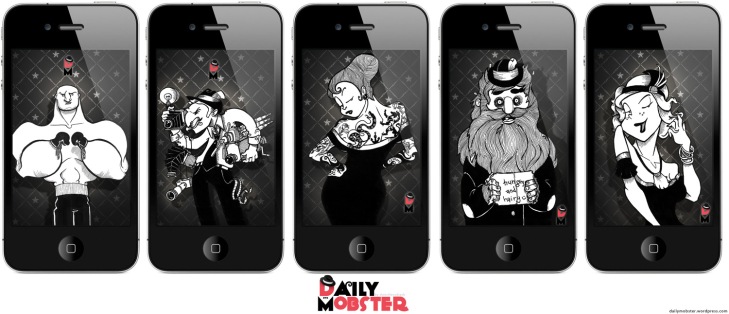
Cool man daddio, how about some swanky skins for the old iPhone?  I thought it about time for poppin’ some swell wallpapers of the most popular mobsters.  Show them around, or just have a little smile every time you turn on your phone at the goofball looking back at you.  If anyone has a special request, just shoot me an email via the contact page and I can try to get to it.  Hope you all enjoy and don’t forget to stop by, and have your friends stop by, The Daily Mobster once in a while.

HD iphone skin wallpaper the daily mobster sketchbookjack funny character cartoon illustration black and white

Download them now, here!

6 Things to learn from the Book Proof

   The proof print for “The Island and the Plough” has officially arrived!  I must say, it is very exciting to see it in physical print.  Regardless of my thoughts on ebooks, and digital media, there is something really great about a book.  I am still sorting the official business with copyrights, and the ISBN registry, which will allow some time for the printers of the final version but it is so good to see this in near finished form.  I want to thank everyone who helped me along the way and have been so patient as well as those who follow and support the entire process.  I can’t wait for this to be a completed project, and then start the next!

  Here are six preview images of the book proof. I tried to choose six images that sort of represent something we can learn from this entire process.

1: First Impressions Are Important

the island and the plough children book sketchbookjack design layout cover black and white cartoon illustration

The front cover of “The Island and the Plough”:

First impressions certainly aren’t the be-all-end-all, but despite the old saying to not judge a book by its cover, people do.  I know I do, but more importantly than judging it is calling attention to and grabbing the eye.  Something catchy, simple, and strong is often a great idea for the front, cover, or introduction of any project. A book calls you by its cover.

2: Dot your Is and cross your Ts.

the island and the plough children book sketchbookjack design layout black and white cartoon illustration page inner

Inner cover pages of “The Island and the Plough”:

The “legal/acknowledgments” section of any project is of the utmost importance.  Noting your sources and identifying yourself is crucial, even on a single image.  There is nothing I hate more than finding a great image or illustration on the web but there is no identifier as to where it came from, so I can never find more of that goodness!  Thank Google for the reverse image look up. Don’t forget to acknowledge those that may have helped. Be gracious, thank those that have honestly helped you, because no project is done alone (even those that physically are done alone, mental, emotional and inspiration support comes from everywhere).

3. Set yourself some rules.

the island and the plough children book sketchbookjack design layout black and white cartoon illustration page play work papa

The children play but Papa warns them of the great white sea in “The Island and the Plough”

Like Papa warning the children of rules of the island, be sure to set yourself some basic ground rules.  Projects very easily get out of hand, grow larger than expected and veer off into unexpected territories.  Be clear with yourself about goals and expectations.  Most importantly make sure your project is manageable!  It is much easier to grow any project than to trim back an unwieldy beast.

4. Know your strengths and embrace weaknesses.

the island and the plough children book sketchbookjack design layout black and white cartoon illustration page tree apple

Papa throws an apple down to Eli in “The Island and the Plough”

Papa has the wonderful idea to throw apples from the tree down to his son Eli who catches them.  This works well until he throws an apple too far, setting forth the entire story.  Know where your strengths will take you and what weaknesses you have that might hold you back.  Focus your strengths to really drive the project and carry the bulk of the work. You may even tailor a project (Like this project I focused on constrast with black and white) to your specific strengths. Work with weaknesses, not against them. Composition, for me, is tricky. To be frank, the children’s books out there have little of it (mostly just an image with text below); finding reference or examples was quite difficult. I needed to be creative and make composition a focus but not let it hold me back as I wanted a very graphic style and include dense typography to help tell the story.

5. Be willing to accept non-perfection.

the island and the plough children book sketchbookjack design layout black and white cartoon illustration page sleep bed

Mama consoles Papa in “The Island and the Plough”

There are many things, even in this final piece or a feature film I may have worked on of which I still want to change. The viewer almost never notices them, so learn when good is good for the sake of the project, time line, goals, and just over all sanity, to not obsess. Like Papa needing consolation from Mama, don’t be afraid to ask for help, critiques and comments. You are your own worst critic, so fresh eyes that aren’t directly attached to the project are best, but try to make it someone who will be constructive and give reasons to what they think rather than claiming something is not working.  Surely, too many comments can lead to a mess, but none is far more dangerous. I suggest getting feedback early on in the process, then work on it a bit for yourself, and then comments near the end (but not so far to the end you can’t take them into account). Try to ask someone other than your mother.

6. Just do what you want.

the island and the plough children book sketchbookjack design layout black and white cartoon illustration cover back description

The reverse/back cover of “The Island and the Plough”


Some of my story ideas are certainly a little “off the beaten path.”  An editor I once talked to said my work is wonderfully unique, but impossible to categorize (and therefore, market).  I was unsure if I should take that as a compliment or a critique. It may be true, and I might possibly only live in a niche market, but that is all I know; do what you know.  I write about what I think about, and things I would enjoy to read or illustrate.  Perhaps, this story is a little heavy for children and I wouldn’t even dare to call this book for children, rather an story for those who also like illustrations. If something is deemed “unmarketable,” I always go back to the fact that someone marketed and sells (a lot, mind you) rubber dog poop and plastic vomit.  Anything is marketable.

Book Proof on it’s way

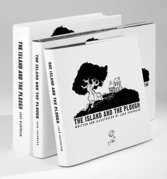
the island and the plough children book mockup layout design cover

I have the first actual printed proof of “The Island and the Plough,” on its way to me.  I am awaiting eagerly for it to arrive.  This puts me ever so close to the finish line for this project.  Meanwhile, I also am working with a friend who is a developer to release an App version of the book with some fun interactive tid-bits and animation.  I hope to have that out soon after the print release.  The above is again, just a nerdy digital book mock up, but I will be able to finally post an actual photo soon!

Another Dead Soldier

I have killed another soldier, a faithful old pen.  He was but a commoner yet filled a many jacket, blackened a many hat, and darkened a many tie.  Yes, I use a Sharpie, sometimes, for inking.  I know it is not preferred and you may already be furling your brow at the low manner in which I behave but I have come to like the Sharpie.  It is simple and consistent and widely available.  I can carry them in a bag and are great for travel or quick works.  I know my dirty, low class pen will never survive the test of time without any “archival quality” ink.  It will wither and fade in the brash sunlight of west Los Angeles, but I don’t care, for it is a impotent artist who requires special tools.  It is a sad artist who blames his tools.  I too, once brandished a fancy Moleskine notebook of which holds glorious, legendary powers in hopes to harness the same genius that bled from Hemingway’s veins, hoping it would make my work magical.  I too, once carried the famed Micron pen and the Staedler pencils, because no actual artist would dare carry (dare not say use) an unbranded, hideously yellow, #2 pencil of which is not even worthy of using the HB insider lingo.  Alas, I still use India Ink, metal tip pens, and brushes but for most everyday workings I have squandered such dreams of Hemingway and draw many of my characters on the forbidden copy paper of which a common, gasp, digital printer might use.  Sure, judgments are passed, scoffs and tisks are handed by those in the supply store.  But I have work to do, dear critic; I have not time to wander the supply store in search of the lesser user of commoner tools I feel may need a lecture.  Unfurl your brow, fellow inker, embrace your unorthodox use of illegitimate tools.

Tommy “Buttface” Jones : Process

tommy_buttface_mobster_process_how_to_tutorial_sketchbookjack_character_design

Here is a sneak peek into the process behind one of The Daily Mobster characters and a quick tutorial/explanation of how I work and how to design a character.

1. I, of course, start with a sketch which are usually smaller thumbnails on a scrap paper until I find an acceptable shape and basic look.  Because of the nature of mobster characters this often revolves around exaggerated features or an interesting shape.  This rule works pretty well for non mobsters as well.  If you can create a silhouette or a shape that is instantly recognizable to that character you are already on our way to great design.

2. Then I do the light  sketch with all the details fleshed out; this allows me to give a little extra focus to certain areas like hands, belts, buttons, or others that need extra attention. This is also the step where you can focus on contrast, as it is the first thing the human eye notices, it is important to decide where heavy blocks of color/black will be and where dense detail will be.  A general rule of thumb, when certain areas are very large in area (such as a belly or a chin) give them less detail as their size will attract attention, and when they are smaller or require extra focus fill in the detail (faces, hands, accessories of interest).   Use the lines and shapes to help direct attention as well, notice the tie points to the chin and continues the crevasse in his chin.

3. Then I simply start inking over the pencil.  Sometimes I ink over the entire drawing with a single width then fill the blacks and weight the lines afterwards and other times I do the complete process little chunks at a time (as seen here) moving across the drawing.  The contrast between full black, white with hatching/textures, and full white is very important in a black and white illustration; luckily suits play a big part in the mobster world.  If the background is dark, realize that a heavy black suit will act as a subtle part of the character and his face will stand out.  If the character has dark skin, often you want to put him in lighter color costumes, unless his environment will be mostly light.   I usually try to balance out the black and the white to create a focal points.

4.  Once completed, I erase the pencil lines that poke out.

5.  The final step is to bring the scan into the computer.  Since the original ink is fairly clean there isn’t really any digital treatment of the character itself other than to overlay it on one of my backgrounds and apply some simple shadowing/lighting effects behind him.  I hand draw the background designs as well (I may post a tutorial about how to make repeating wallpapers from drawings like this) in line format, then scan them in, convert them to white and overlay them on grey repeatedly.  Tommy will be posted on Thursday, so be sure to check out The Daily Mobster and read his story.

40 Mobsters for The Daily Mobster

Who knew I could make it this far with just a silly mobster theme?  I have to admit that I worried, I cried, I even confessed to “Mad Ma” Johnson that early on,  I would run out of ideas and she might have to break my knuckles.  But, I am quickly finding out that just about anything can be turned into a goofy character; I mean, there is a character based entirely off of neckties, and looks like a necktie!   The Daily Mobster has just reached 40 mobsters and is quickly nearly the 50 mark!  I have a special announcement to make when we reach 50 so make sure to stay tuned, and share with a friend.  New readers are always welcome and if you have ideas, thoughts or comments, share them!  Thank you all for the following and support.

mobsters process sketching table at work drawing inking cartoon illustration photo mobsters characters design